funnel plot
- related: Biostats and Study Design
- tags:
- source:
Funnel Plot
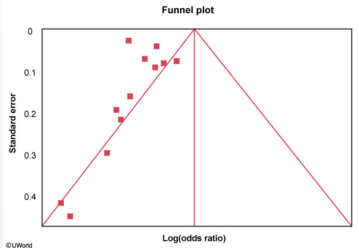
A funnel plot is helpful in assessing publication bias. Each study’s treatment effect (on the x-axis) is plotted against a measure of that study’s size or precision, usually using the standard error of the treatment effect (on the y-axis). The triangle is centered on a summary estimate of the treatment effect (eg, pooled estimate of odds ratio, usually in log scale) with its sides corresponding to standard errors. If there is no bias, any scatter between the study results should be due to sampling variation, and 95% of studies should lie within the triangle centered on the summary estimate and extending 1.96 standard errors on either side. Because a larger sample size is associated with increased precision, larger studies (more powerful) will be at the top and have a narrow spread whereas small studies will be scattered widely at the base of the triangle.
Funnel plots should be symmetric in the absence of study heterogeneity and publication bias. In this figure, however, there are no studies on the right side of the funnel. This asymmetry suggests publication bias (ie, studies showing null/increased effect of drug X on mortality are noticeably absent as they are less likely to have been published). Other possible explanations for asymmetry include heterogeneity, methodological anomalies, artifact, or chance.
A small sample size (low number of patients) in the drug X treatment arms would lead to more studies at the base of the triangle because such studies would have lower power and larger standard errors.